Key Elements
Who: Kat & Ted, coaching service
What: Logo design
Where: Lead from local Facebook group
When: As soon as possible
How: Three working days from first contact, one in-person meeting, 3 hours design work
Client Type: Local start-up
The Brief
Kat wanted a logo that reflected her brand; a warm, supportive, and unique coaching service for local women. She had some ideas on how this might look – key elements included her beloved teddy bear, Ted, and a whimsical girl representing her own child-self. A photo of the bear and a drawing of the girl were provided, along with some direction on placement. It was important to Kat that the bear was an accurate representation, and that the child should be holding or playing with it. Kat asked that the photo of Ted be combined with a line drawing of the girl in the logo.
At first, this sounded like quite a difficult brief to meet! But Kat’s passion shone through and I knew the end result would be fantastic if we could find a way to bring it all together.
The photo of Ted
Kat's drawings of the girl
The Design Process
Firstly, a meeting was arranged. This was important to Kat, who wanted to discuss her ideas in person, and also to me. I find it’s much better to meet a client if possible, to get a better understanding of their business and their goals. Visiting the business address and seeing it for yourself is a key part of the process – yes, we could design a logo from an online chat easily, but our clients value the deeper understanding we always aim to achieve.
In the time before our meeting, I created a concept that met the brief. This was to aid our conversation and give Kat a starting point, and make it easy for her to point out design elements she liked, disliked, etc. As no colours or brand fonts were discussed, I picked out the bear’s pyjama colours and chose a font that I felt matched the brand.
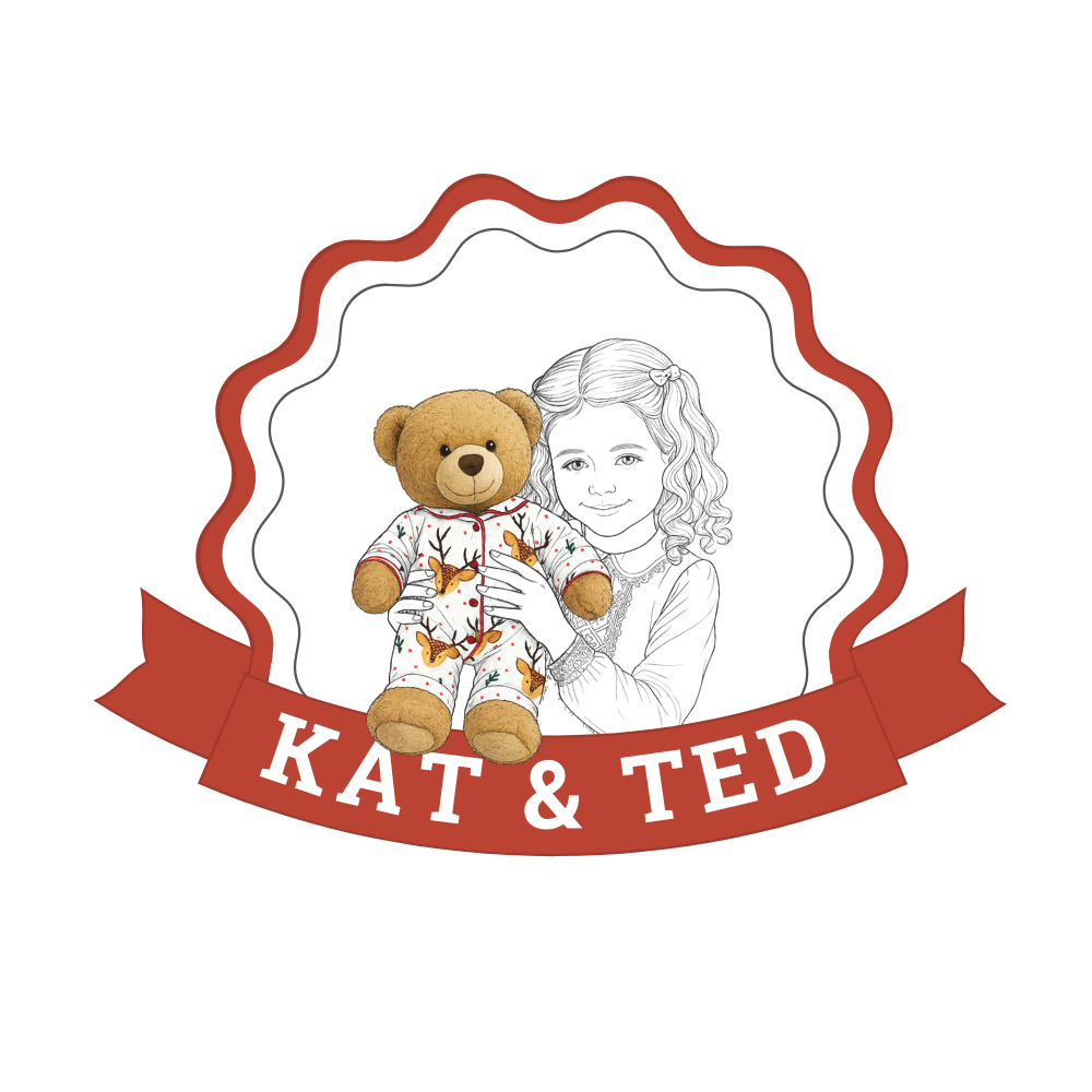
The concept
Kat's feedback
- Love the design overall!
- She would prefer Ted’s pyjamas to be changed for more traditional green or blue striped / checked.
- Her Irish heritage was important, and she would like green and/or orange as a key colour to reflect this.
- The girl could be more wild looking – she is free-spirited!
During our meeting, Kat shared so much about her brand – its history, her goals, her approach to coaching. I got a really good feel for her as a person and how she connects with her clients, which made it much easier to refine the design. She shared her love of the free ink drawing style of Charlie Mackesy, which I wanted to incorporate into the girl. As always, being invited into the home of clients to learn more about them and their business was enlightening. It always feels wonderful to be a part of their journey.
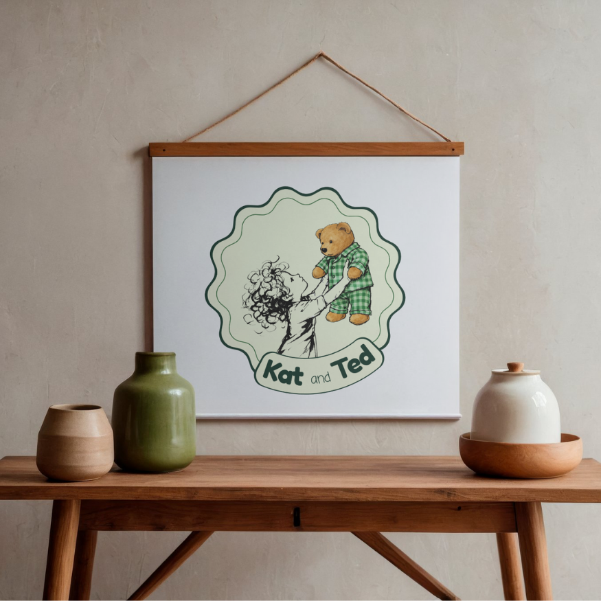
After the meeting, refinements were made to the concept. Some elements, such as the banner, didn’t work with the new style and so they were swapped out with a more fitting alternative. A white background was swapped for a light green, and the font was changed to be in keeping with Kat’s vision for a playful yet simple style.
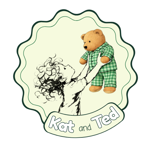
Two versions of the logo were created for Kat’s approval. Kat chose design one, amending it to recolour the orange line with the green of version two.
Logo 1
Logo 2
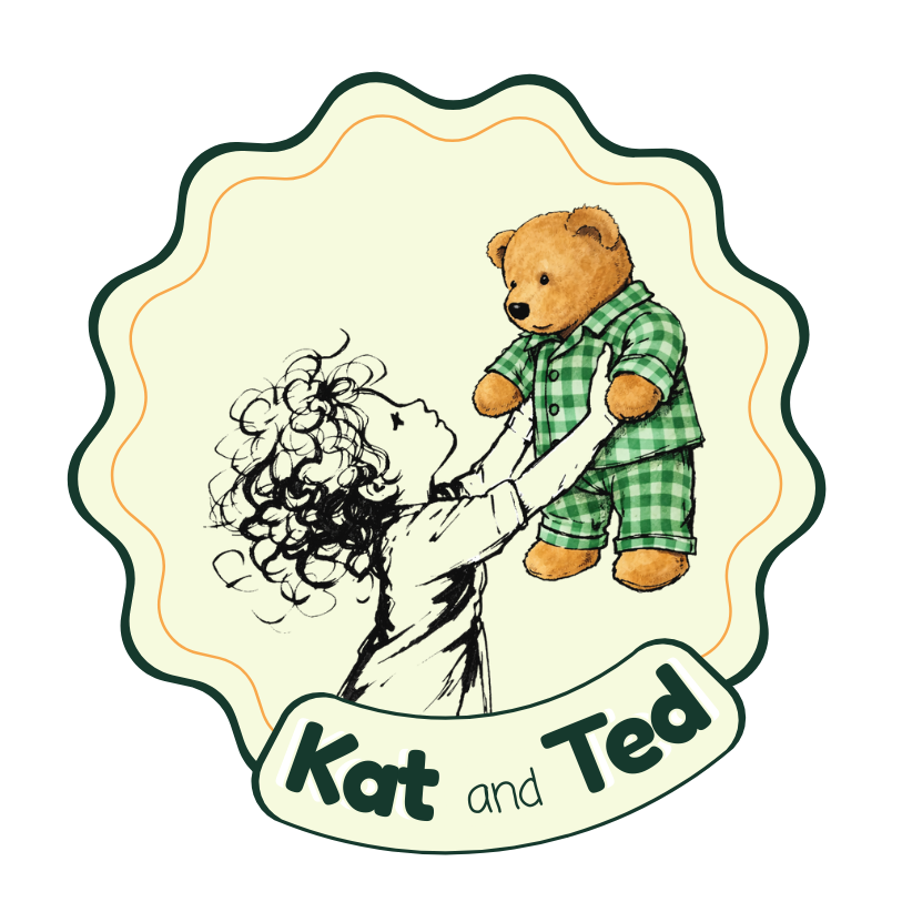
The final logo design
Client Feedback
Kat was over the moon with her new logo, and wrote a lovely review on our Facebook page as well as two other places! Her direct feedback was that she ‘loved it so much she could cry!’ and that she really appreciated the bespoke approach we took to understanding her.
Facebook Review
“I cannot express how personalised and insightful Hollie’s approach to supporting me is. She delved deeply to understand my business, motives, character, goals and background and then produced a totally bespoke and perfect Logo! I will definitely seek her help with marketing in the future.”
Thank you Kat, we wish you all the best with Kat and Ted!